Who Actually Cut Their Emissions?
Countries report the emissions released inside their borders. That is the number in the treaty and the number in the headline. It is not the same as the emissions caused by what those countries consume, and for most of the nations claiming progress, the difference is large enough to change the story.
Two numbers for the same country
There are two defensible ways to answer how much a country emits, and they do not give the same answer.
- Territorial. Emissions physically released inside the borders. This is what governments report and what the UNFCCC counts.
- Consumption based. Emissions caused by what residents actually consume, wherever those emissions were released. A fridge built in Guangdong and used in Manchester puts its emissions on China's ledger under the first method and on Britain's under the second.
Neither is wrong. They answer different questions. But only one of them gets reported, and the gap between them is where a country can look like it is decarbonising while the emissions its economy drives have barely moved.
Pick a country and see both
The United Kingdom is the cleanest illustration. Territorial emissions fell from 602 Mt to 308 Mt, a cut of 49%, which is a genuinely large reduction and gets cited constantly. Measured by what British consumption causes, the fall is from 666 Mt to 487 Mt, or 27%. The 115 Mt difference did not stop existing. It moved.
Is that one country or a pattern?
Of the 40 countries that reported a territorial cut between 1990 and 2023, 34 saw their consumption emissions fall by less. For 11 of them, the emissions their consumption causes actually rose. The median country's reported cut overstates the reduction by 39%.
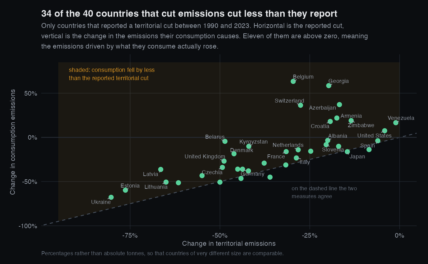
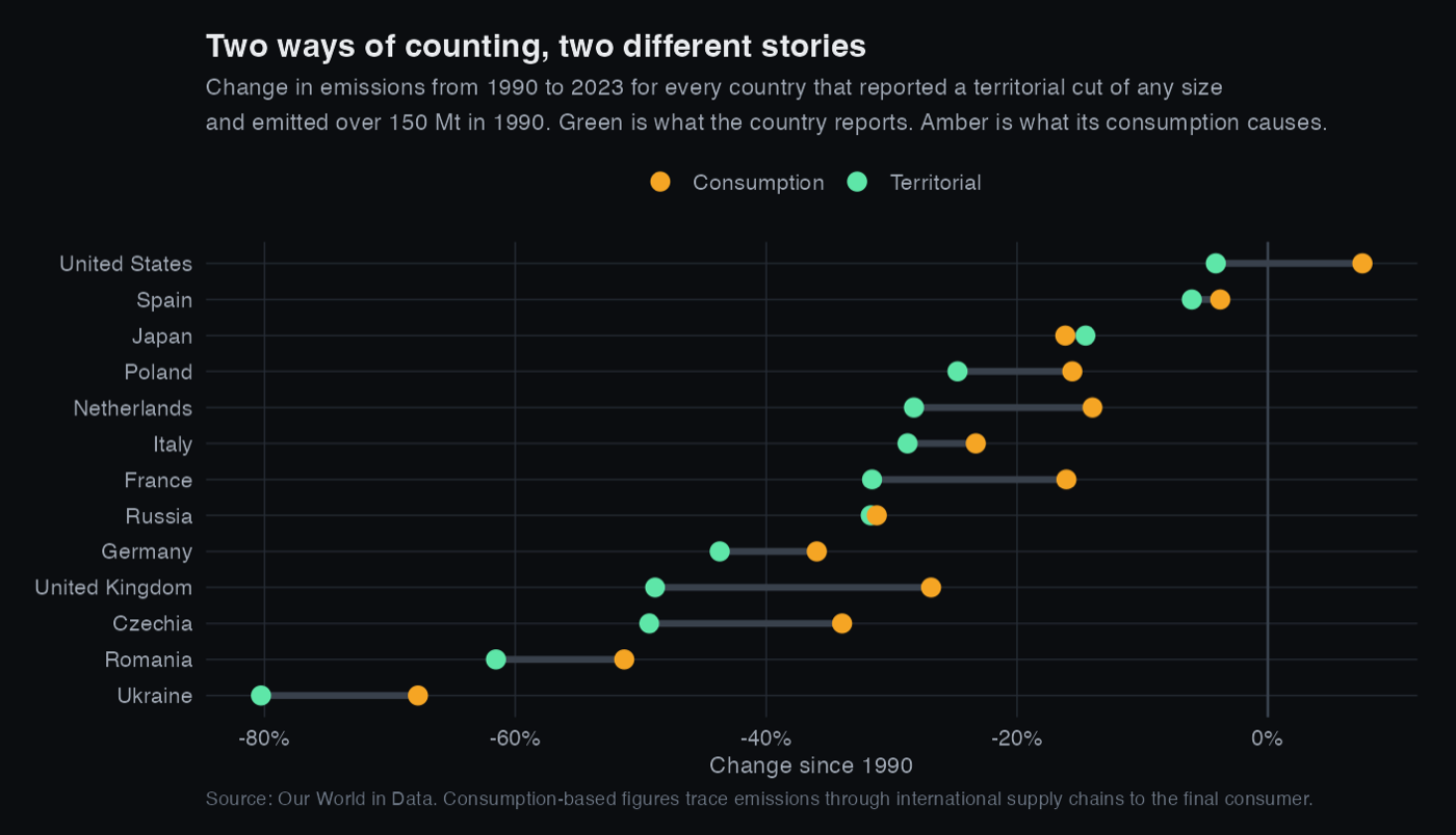
Germany is the useful counterexample and the reason I do not think this is simply an accounting trick everywhere. Germany cut 461 Mt territorially and only 29 Mt of that is unmatched, so roughly 94% of its reduction survives the change of measure. Coal retirement and renewables are real. The point is not that nobody decarbonised, it is that the reported number cannot tell you who did.
Where the emissions went
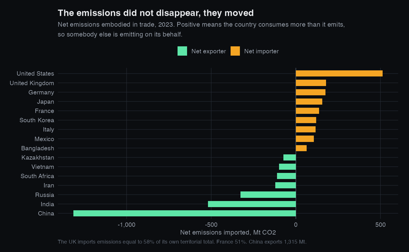
This is the part that makes the accounting question more than semantics. When a wealthy country's factories close and the goods keep arriving, its ledger improves and the atmosphere does not notice.
The check that decides how to read all of this
If consumption accounting simply uncovered emissions nobody had counted, the world total would be bigger under it. So test that.
Globally the two measures are the same number. Consumption accounting does not reveal hidden emissions and it does not let anyone off. It redistributes an identical total between ledgers, which is exactly why the choice of ledger matters so much to the country holding it.
How much of this would survive being wrong
Territorial figures come from fuel statistics and are comparatively precise. Consumption figures come from multi region input output models built on international trade tables that are themselves estimates, so their uncertainty is far larger, commonly put around 10% for large economies and worse for small ones. That asymmetry matters, because the entire finding lives in the difference between a precise number and an imprecise one.
So I ran the adversarial version. Suppose every country's consumption figures are wrong by 10% in whichever direction most flatters that country, at both ends of the window at once.
18 of the 40 still show an unmatched gap. That is a real weakening and I would rather show it than bury it. It is also a deliberately brutal test, because input output model errors for one country are correlated across years rather than independent, so assuming a maximum adverse error at both ends simultaneously is close to the worst case that could be constructed. The honest reading is that the aggregate pattern, 34 of 40 countries pointing the same way, is robust, while any individual country's percentage should be treated as approximate.
Two further limits worth stating. First, not all of this gap is deliberate offshoring. Some of it is ordinary economic development and comparative advantage, and this analysis cannot separate a firm relocating from a country simply buying more. Second, one ratio in the results is meaningless: the United States reports a territorial cut of only 4%, so dividing by that tiny base produces an unmatched share of 278%. That is a small denominator, not a finding, which is why the charts lead with the two percentages rather than their ratio.
What I would do next
- Decompose each country's change into the part explained by cleaner energy, the part by changed industrial structure, and the part by trade, rather than treating the residual as one lump.
- Use the underlying input output tables directly instead of a pre-computed series, which would let me attach real uncertainty ranges rather than a sensitivity assumption.
- Bring in consumption per person alongside the totals, since a country of 5 million and one of 300 million are not comparable on absolute tonnes.